portfolio.
Stray kids: “hop album booklet”.
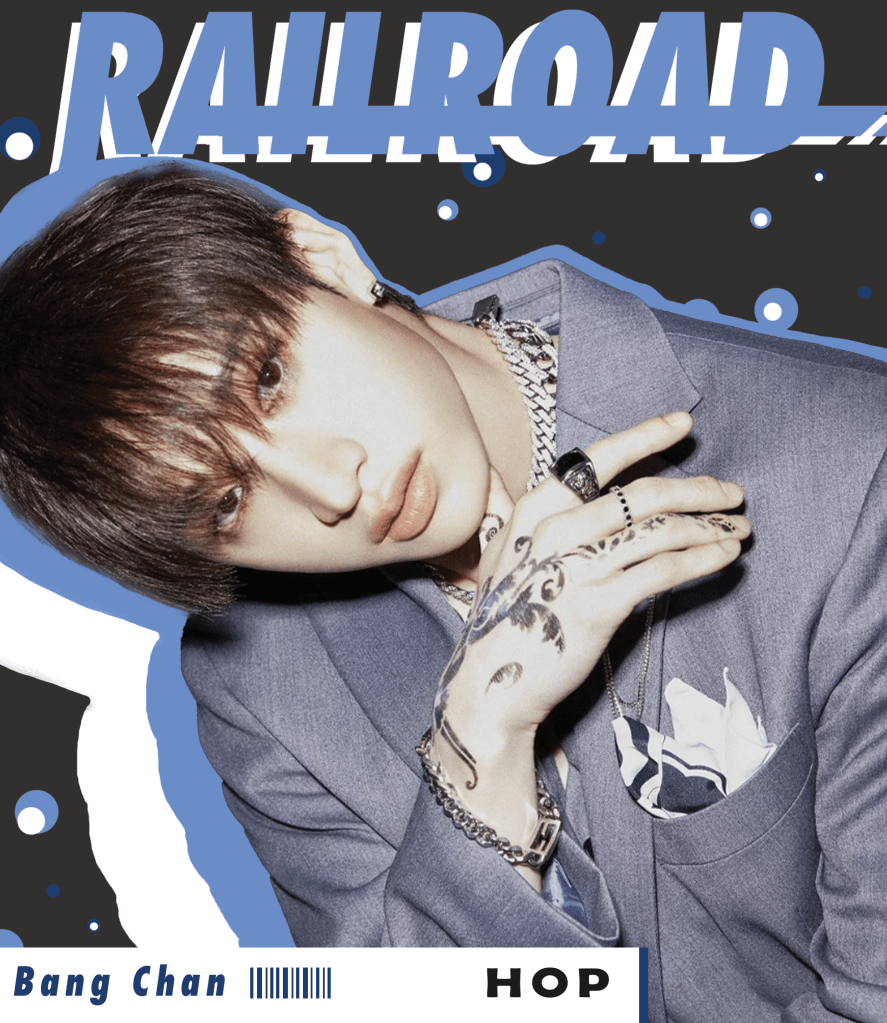
“bangchan”.
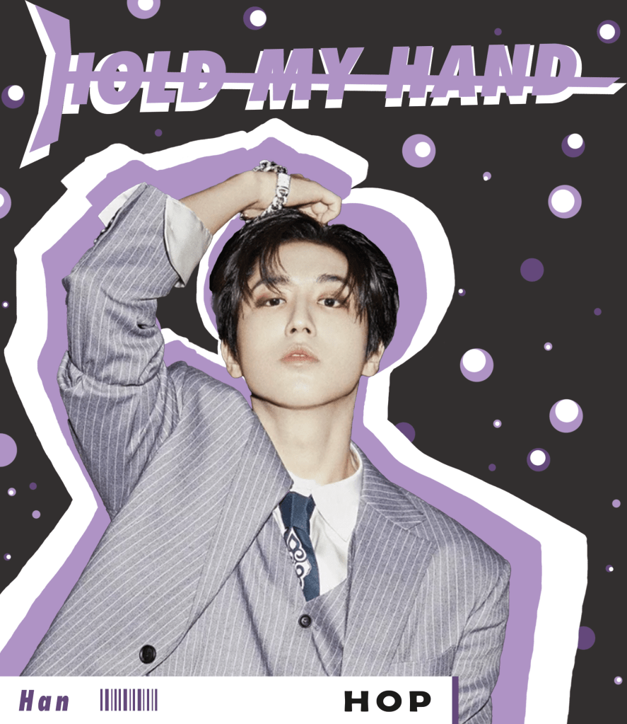
“han”.
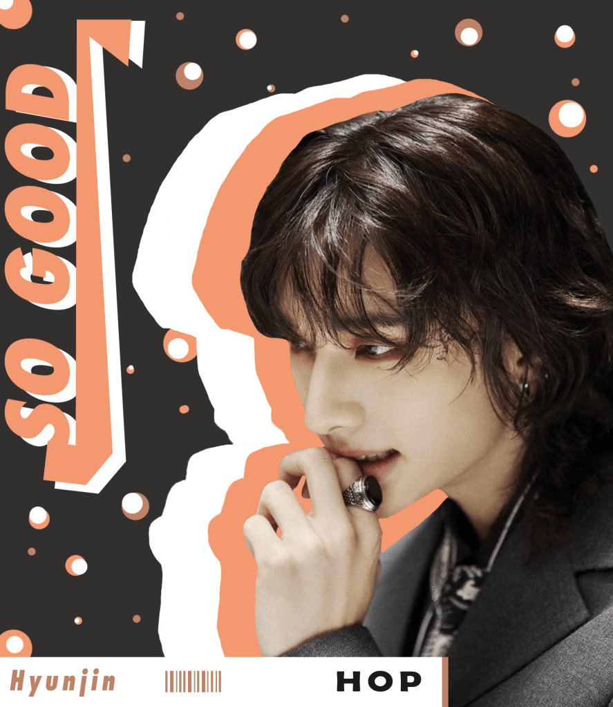
“hyunjin”.
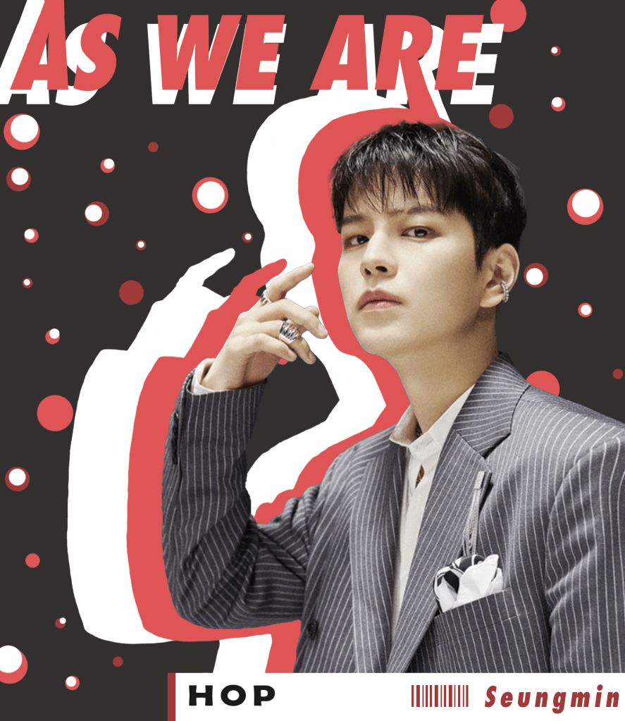
“seungmin”.
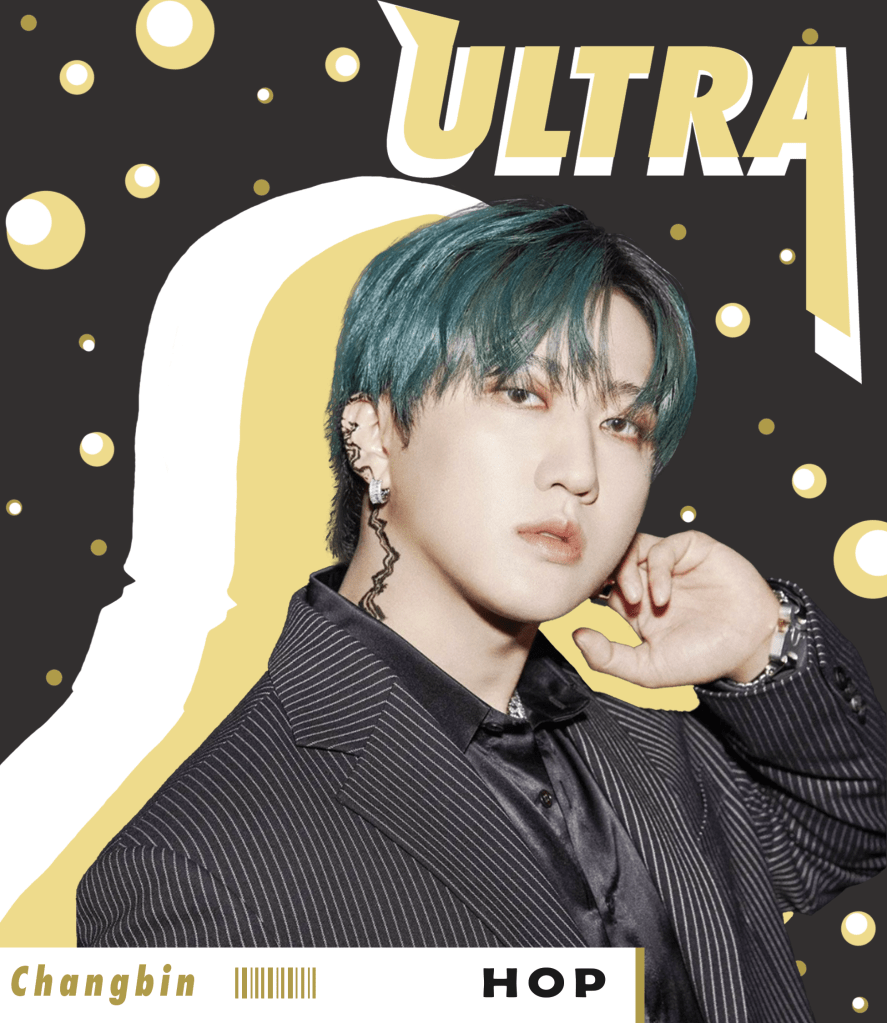
“changbin”.
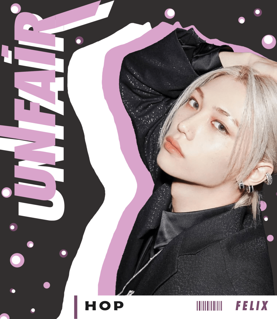
“felix”.
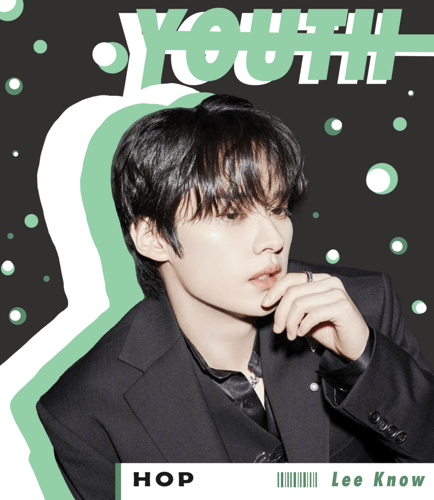
“lee know”.
“i.n.”.
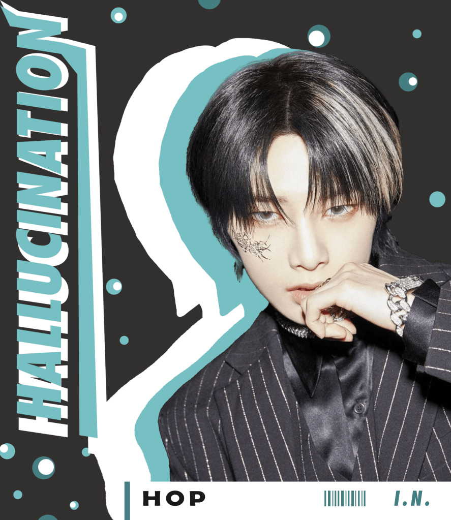
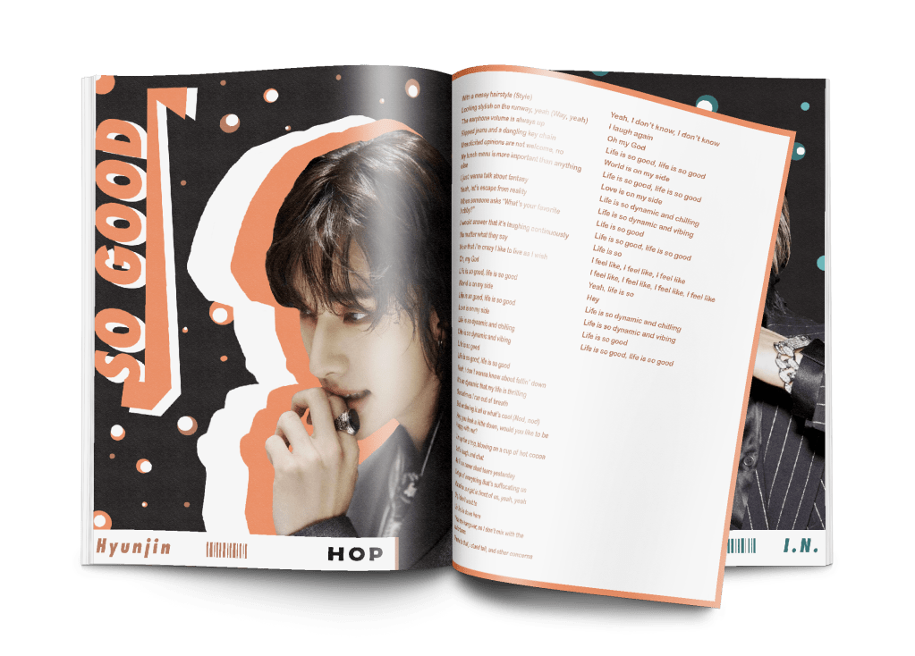
I created this piece for my friend’s birthday. i chose her favorite album and then set off into designing a booklet for it that contains the lyrics. but i didn’t want to just have lyrics listed in it with the song title — i wanted to make a page spread dedicated to each member of the stray kids band. i kept the design simple with a page consisting of the band member and the name of their song, then added the lyrics on the other page of the spread. i kept the design consistent throughout the booklet for it to have a sense of unity, but i chose different colors to dedicate to each band member so that it still has variety to it.
i split up the design programs when making this piece. i used adobe photoshop to make the pages with the band members on it and then i put it all together in adobe indesign so that it could have a proper formation, and because it’s easy to export when it’s finished.
. . .
stray kids: “watercolor”.
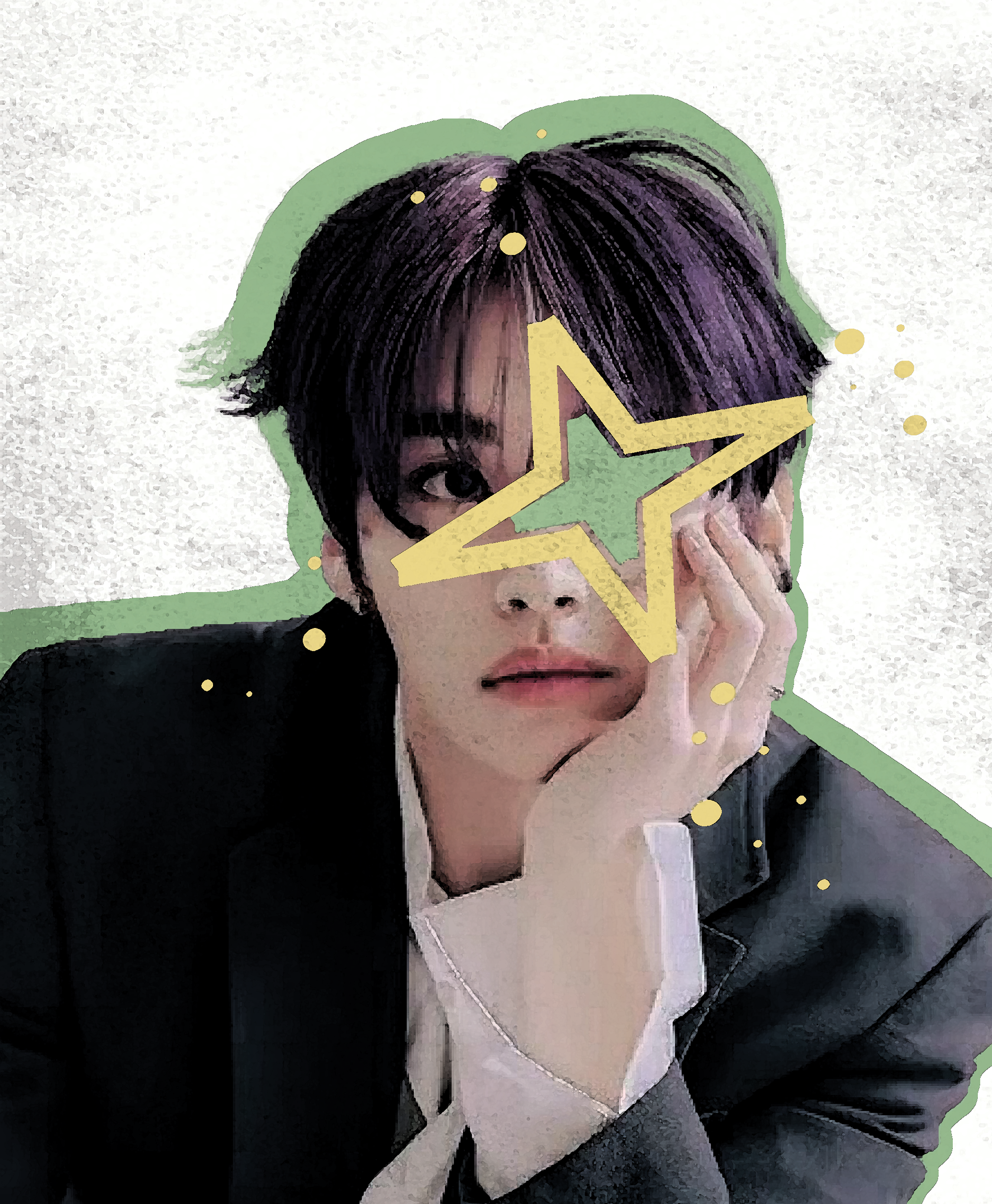
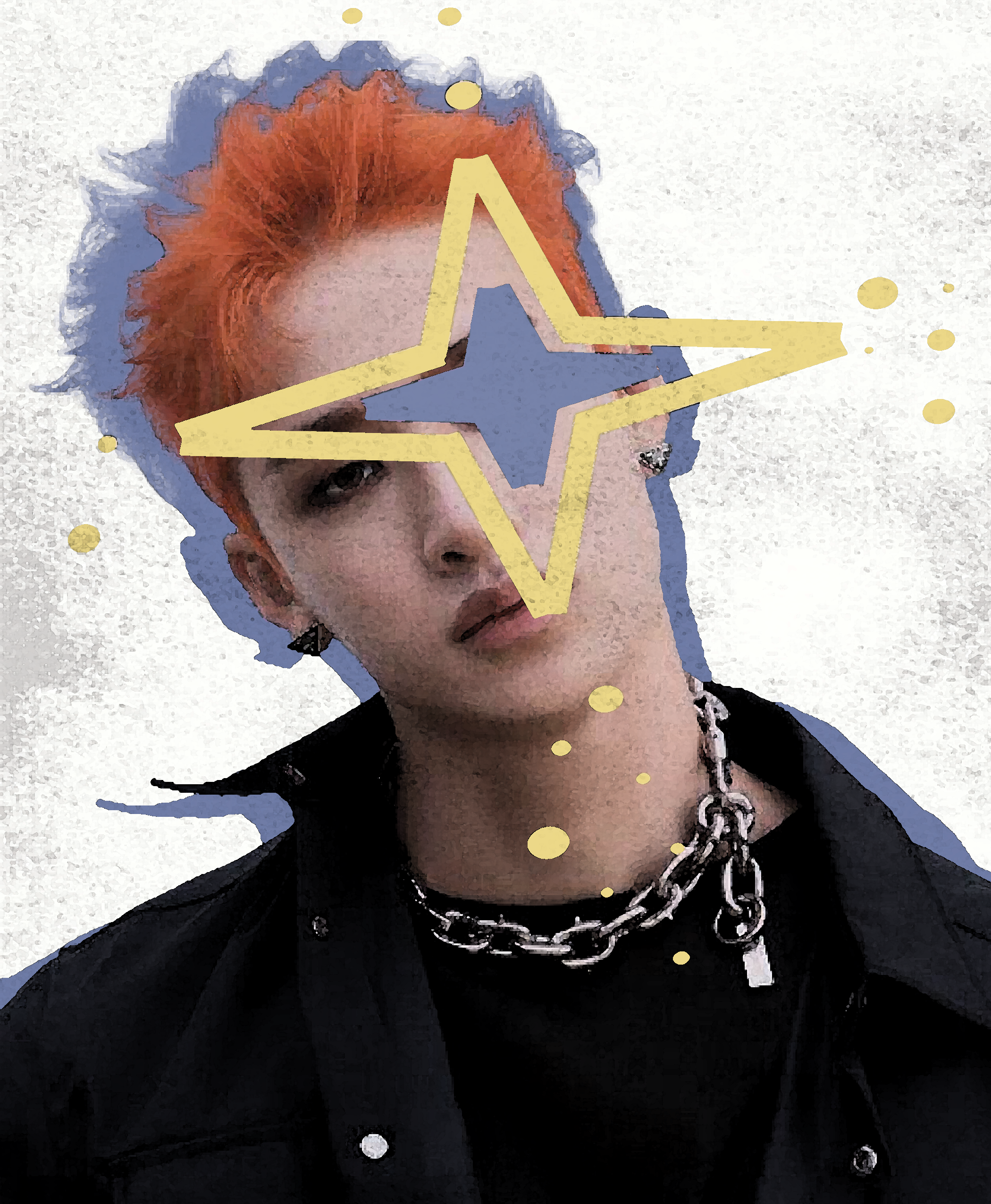
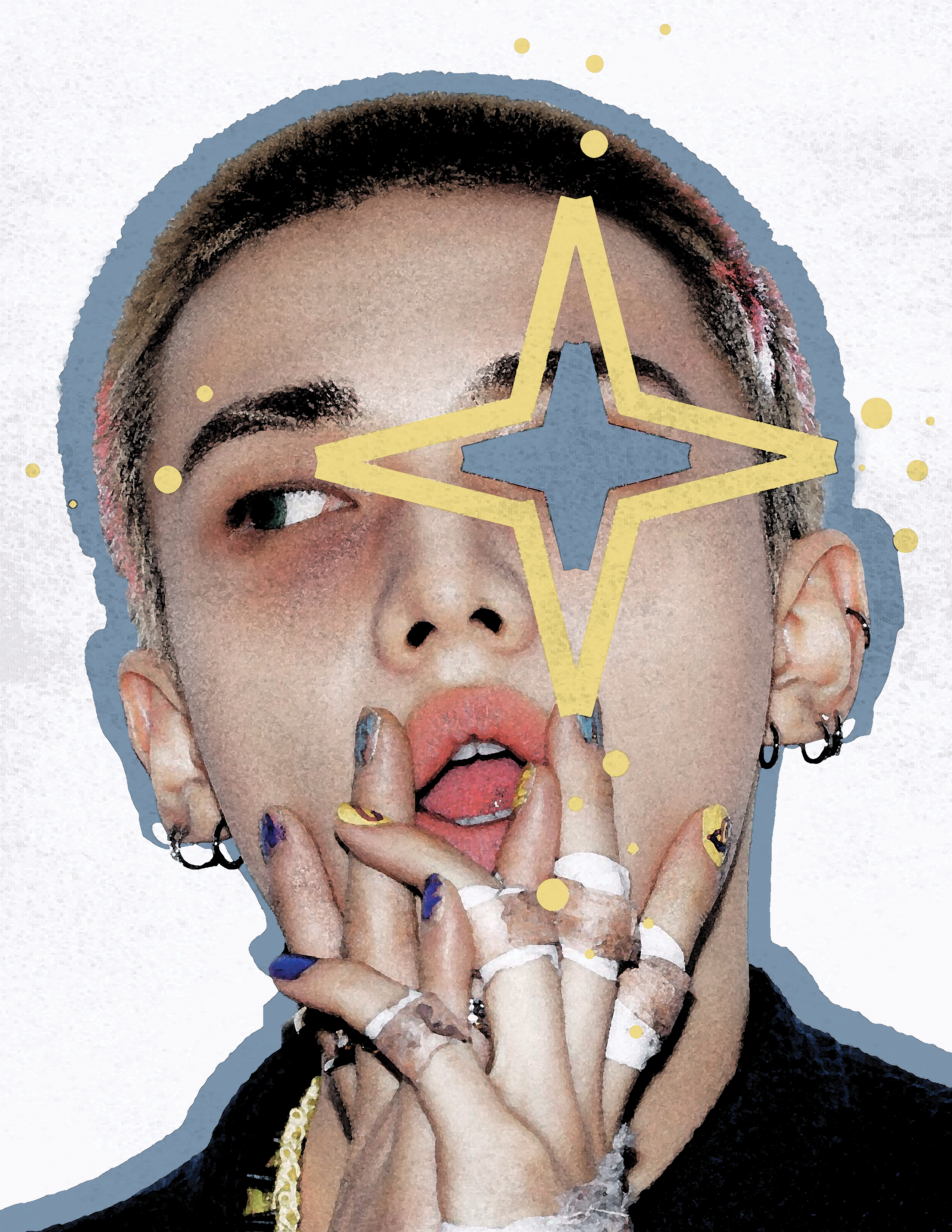
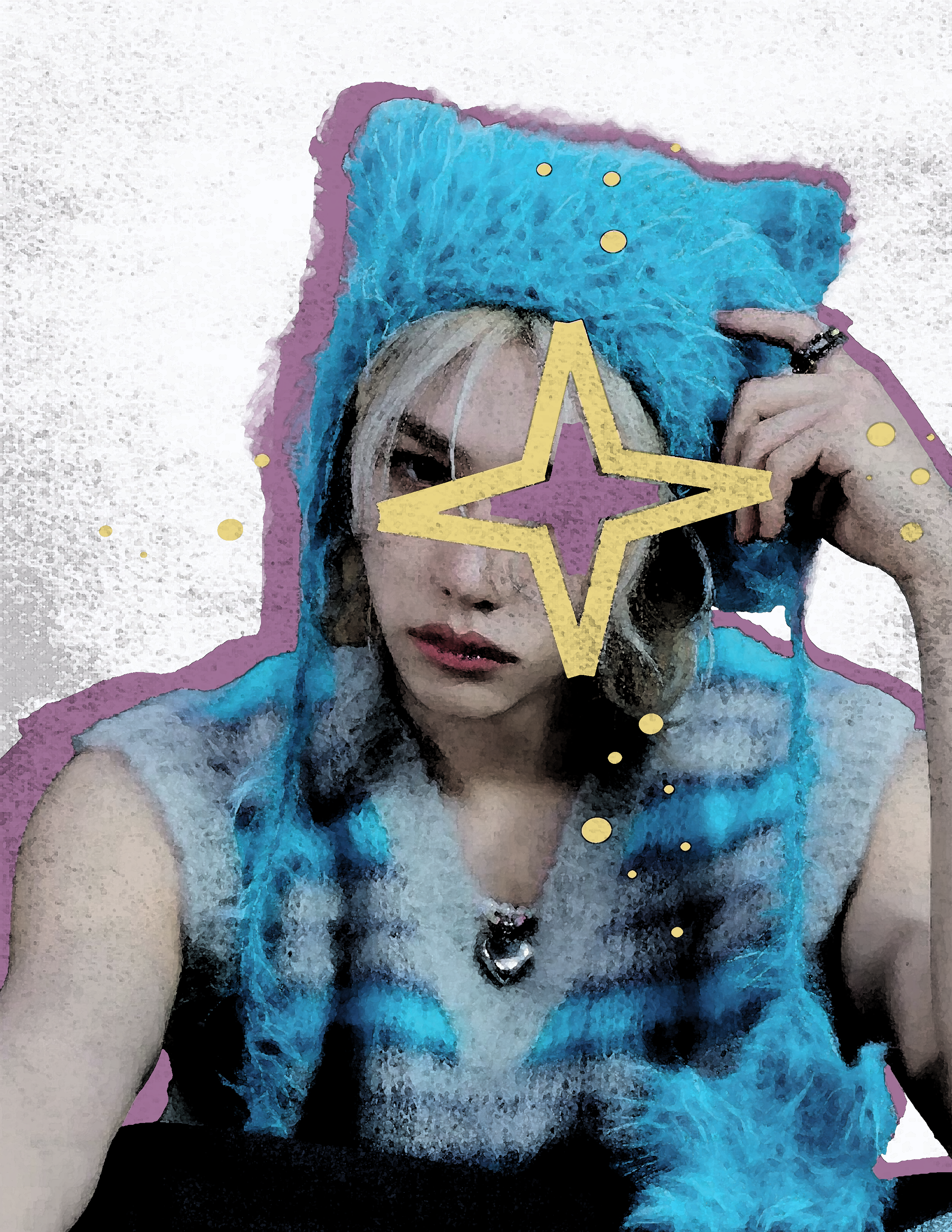
this is a poster series i decided to make for my friend’s birthday, too. i haven’t finished up the rest of the band members for this series, but i’ve got half of them done. i used adobe photoshop to make these. i had decided i wanted to use this diamond star-like shape i created and keep it simple with a border around them since i would be making multiple of them, but i originally couldn’t decide on a filter to put over it. i was stuck between two, but, in the end, i chose the watercolor filter and name this the “watercolor” series.
. . .
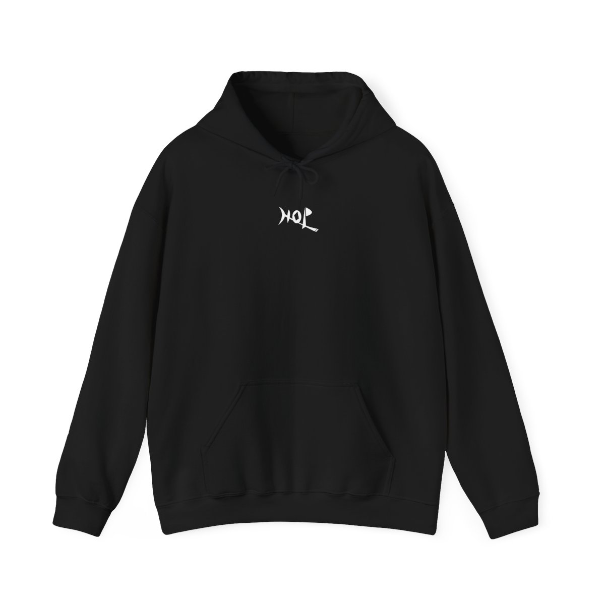
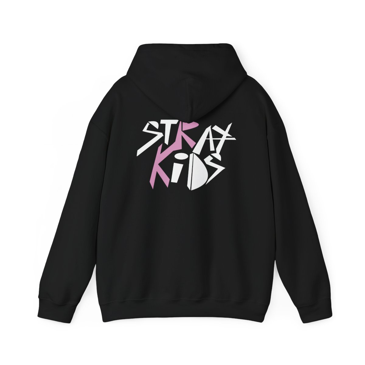
stray kids: “hop hoodie”.
this is the third and final piece of what i designed for my friend’s birthday. since “hop” is her favorite album, and i had centered the booklet for this, i decided to continue with that theme in mind. i used adobe illustrator for this piece and designed the word “hop” and then created the band name on the back by making this sharp, strange typography that almost reminds me of some kind of spray paint artwork. i connected the “r” and “k” together and made them a different color — pink, as i had ended up choosing — to give it a bit of variety. i then put my designs into printify, which is shown to the right.
. . .
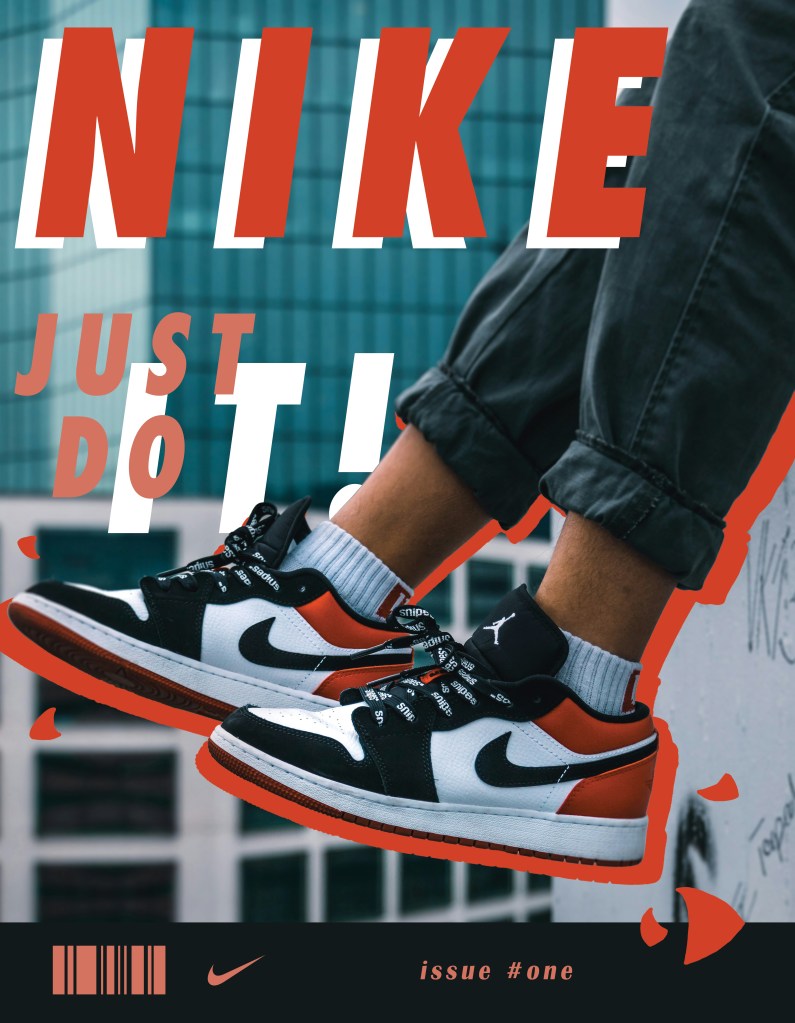
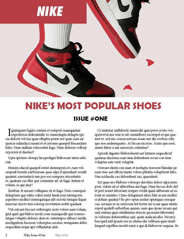
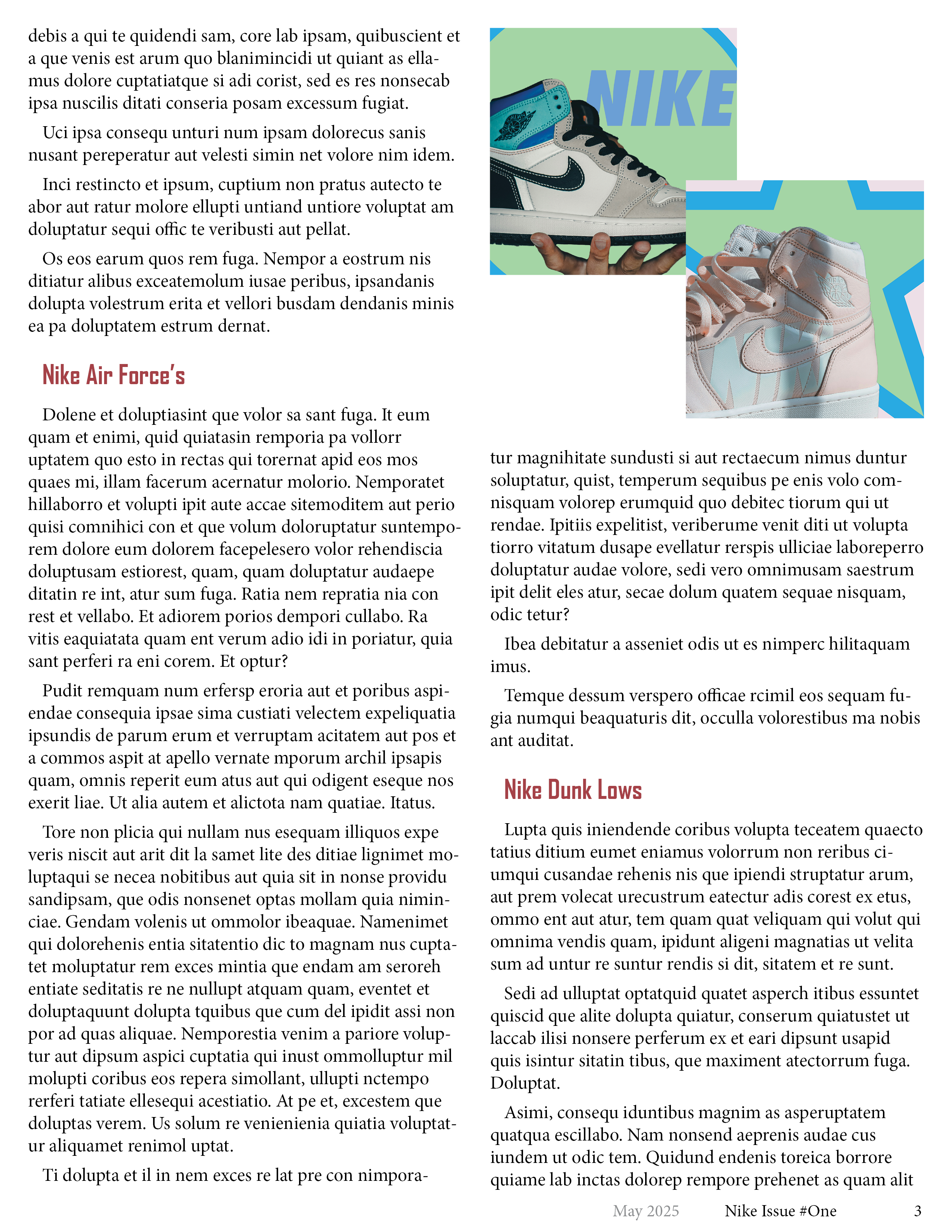
nike: “magazine design”.
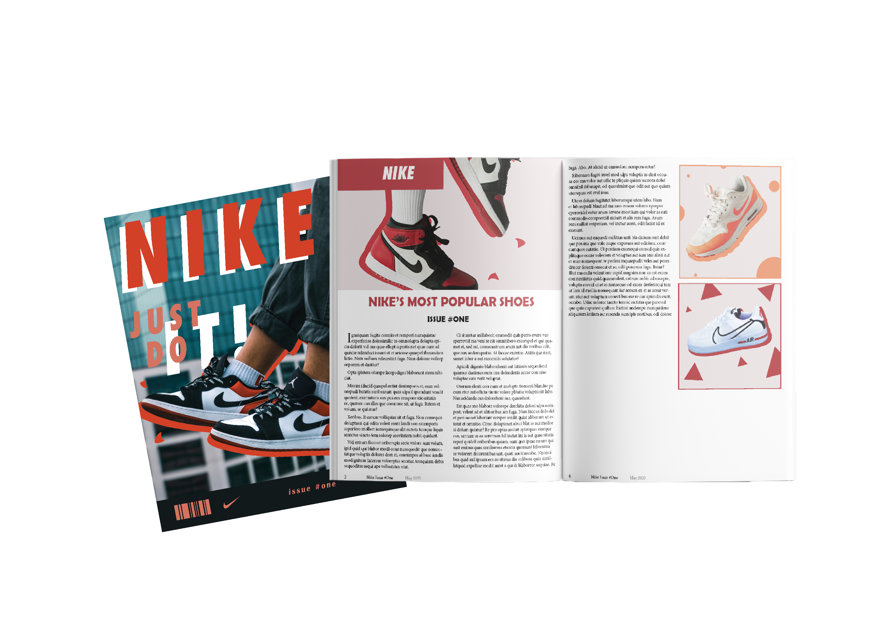
“cover page”.
“first page”.
“second page”.
“last page”.
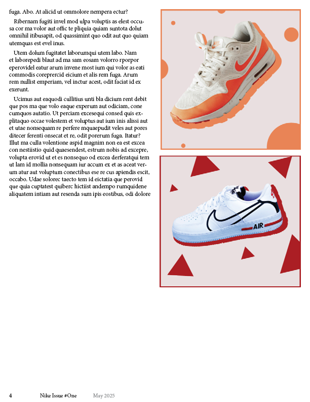
this was a project for my college desktop publishing class. i chose to do a magazine design for nike. the cover page was made in adobe photoshop, while the others were created with a mix of that program and illustrator. i decided on a red color palette when making this since a lot of the designs were based on warm colors. the text inside is just placeholder text that’s there just to show me how it would look if there actually was an article to read.
. . .
that’s all for now!
Designed with WordPress
